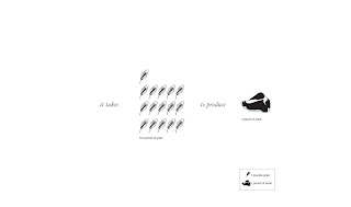
 These experiments evolved from the fact that 16 pounds of grain is need to produce 1 pound of meat. The significance of the fact stems from the unbalanced ratio of what goes into making the meat and what comes out.
I began exploring different perspectives that could be taken with this information to show it in a different way. From a single person to a family of four and what we put into a cow and what we get out of a cow.

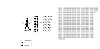
 An average Americans consumption of meat and the underlying usage of grain and water that are apart of every piece of meat but is not apparent.
 A four person family uses more resources than an average person does. This shows the cost to the environment that a four person family produces.
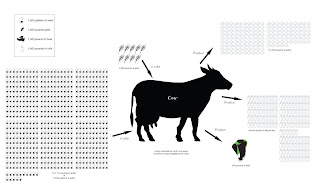
 This one shows the large amount of resources that are used to sustain a cow. In contrast to what we as the consumers get from the cow (meat and milk) and then the left over waste that pollutes our environment.
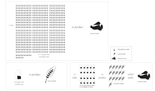
 With this infographic I tried to break down the infomation that I was using into sections that together told a story.

1 comment:
i understand your question, and i understand your graphics, but i don't really see how these are answering the logos vs pathos question. it all seems very logical and objective to me right now, and i don't have any basis for comparison as to what might make these pathos. so what does make any of these logos vs pathos?
is it the facts you are choosing to display? is it the rendering style, as you asked about earlier? is it some other variable (color vs b/w) that affects how people view it?
do you need to do some kind of direct comparison between the exact same two charts and try to push it in each of the two directions?
on a side note, i think if you are going to make a case for eating vegetarian, you need to clearly show the alternative, which is eating the grain directly, or using the same ground to grow food for humans. the alternative needs to be clearly displayed. but maybe you're not to that point yet.
Post a Comment